Brand Consulting · November 18, 2026 · 6 min read
Poster Design Principles: Visual Hierarchy, Typography, and Clear Calls to Action
Design promotional and event posters that command attention across print displays, LinkedIn feeds, and mobile WhatsApp shares in under three seconds.
By xiom (Principal Growth & AI Web Architect)
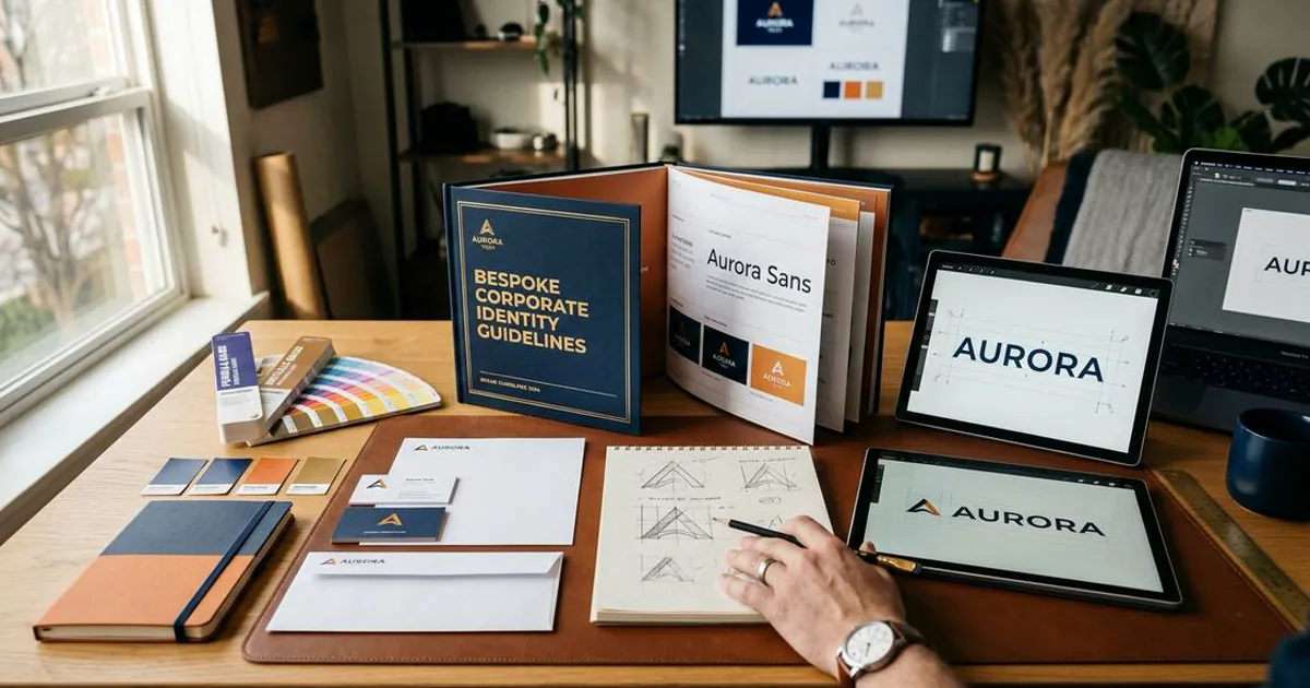
Cluttered posters lose viewers instantly. Master the grid structure, three-level typographic hierarchy, negative space, and scannable CTA rules behind memorable poster design.
Structuring Three Clear Reading Levels on Every Poster
Viewers give a street billboard or social poster less than three seconds before scrolling past. Effective poster design limits text into three deliberate levels: one unmistakable headline, one supporting detail block, and one direct call to action.
Respecting Breathing Room and Margins
Filling every corner with badges, logos, and paragraphs ruins visual impact. Generous negative space draws the eye cleanly toward your focal graphic and keeps event dates, locations, and booking links effortlessly scannable.

- Lead with one dominant headline visible from across a room or on a phone thumbnail.
- Reserve at least 30% of the canvas as open whitespace to sharpen visual contrast.
- End with a single clear QR code, short URL, or WhatsApp contact line.
Matching Campaign Posters With Dedicated Landing Experiences
A striking poster only pays off when scanned QR codes or clicked social links land on a matching campaign page. Align colors and headlines across your Graphic Design Systems and Website Design Architecture.
You can also connect poster inquiries into First-Click Intent Alignment so campaign clicks convert consistently.
Continue Reading on Digital Pulse
- Essential Strategy, Website and Digital Presence for Business Growth in Mombasa and Nairobi
- The Core Shifts in SME Web Features for 2027: Practical AI UX & CRO
- WhatsApp Web for Business: Setup, Security, and Workflow Automation Guide
- What Is Web Design? Core Elements, User Experience, and Modern Standards
- Web Design Kenya: Mobile Speed, M-Pesa Checkout, and Local SEO Benchmarks